ShopDreamUp AI ArtDreamUp
Deviation Actions
Daily Deviation
Daily Deviation
February 27, 2013
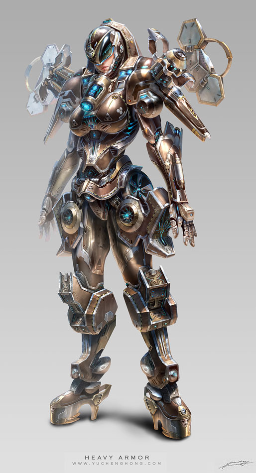
Project D-Heavy Armor G by *yuchenghong
Featured by alltheoriginalnames
Suggested by DKDevil


Suggested Deviants


Suggested Collections


You Might Like…


Featured in Groups


Comments191
Join the community to add your comment. Already a deviant? Log In
okay lets start off with. ITS A GREAT FUCKING PICTURE there is no real denying that and its actually really hard to pick apart the picture since its so well done. it shows different profiles (front,side,combo of both). the colors compliment each other wonderfully. the bronze the golds the silver the soft vibrant blues work beautifully and its very pleasant on the eyes. i love the way the armor has this...woven look like it was sewed together even thought i know its all metal. the nitpicks are small but there first ill start with the the first thing that caught my eye and those were the shoes the armor looks wonderful but the highheels really throw it off i like the brace on the back of them but the heels really look unnecessary and it don't really fit some simple shoes like the very top of the heels or combat boots would of been a much better choice the brace on the back is a nice design but again the heels don't really fit the next issue would be the fingers on the back hand as you go back they start having a transparent look like they are ghost fingers a little darker coloring would of been what they needed just to show the fingers are there even in that white light. the last real nitpick i have is the "triforce" on the breast on the right one the point is pointing straight up and on the left one its pointing a little to the left i see why you did this. its cause you drew her leaning on one leg but even if she was leaning the points will still be aiming at the same direction which is why you lost like half a star on technique for those three issues. but you are a great artist i can tell you are just by this picture and your previews for your gallery so keep up the great work